
JET LATAM
Mobile App • 2025
The JET LATAM case study is currently available in the desktop version only—it’sthe best way to view the screens and UI details.

JET LATAM
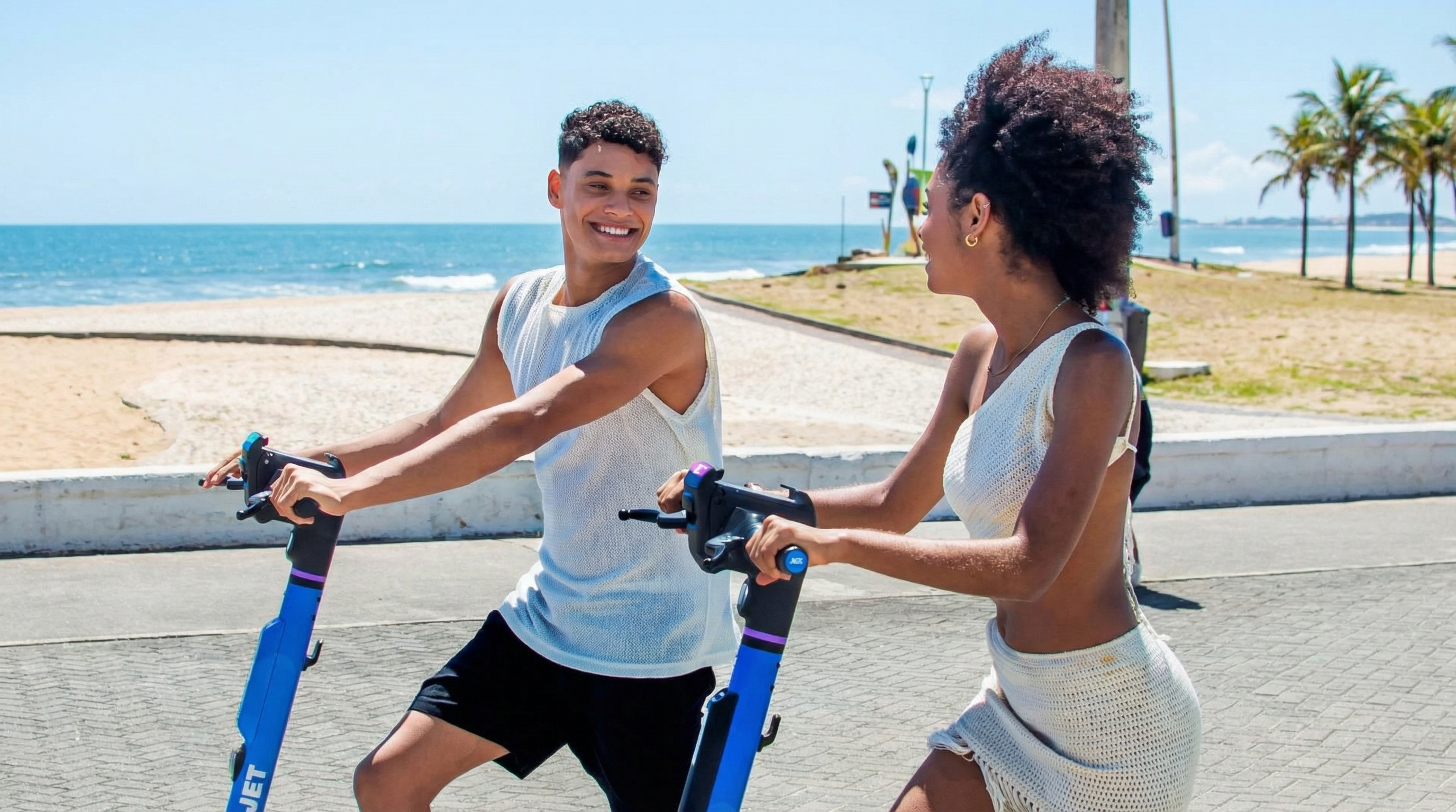
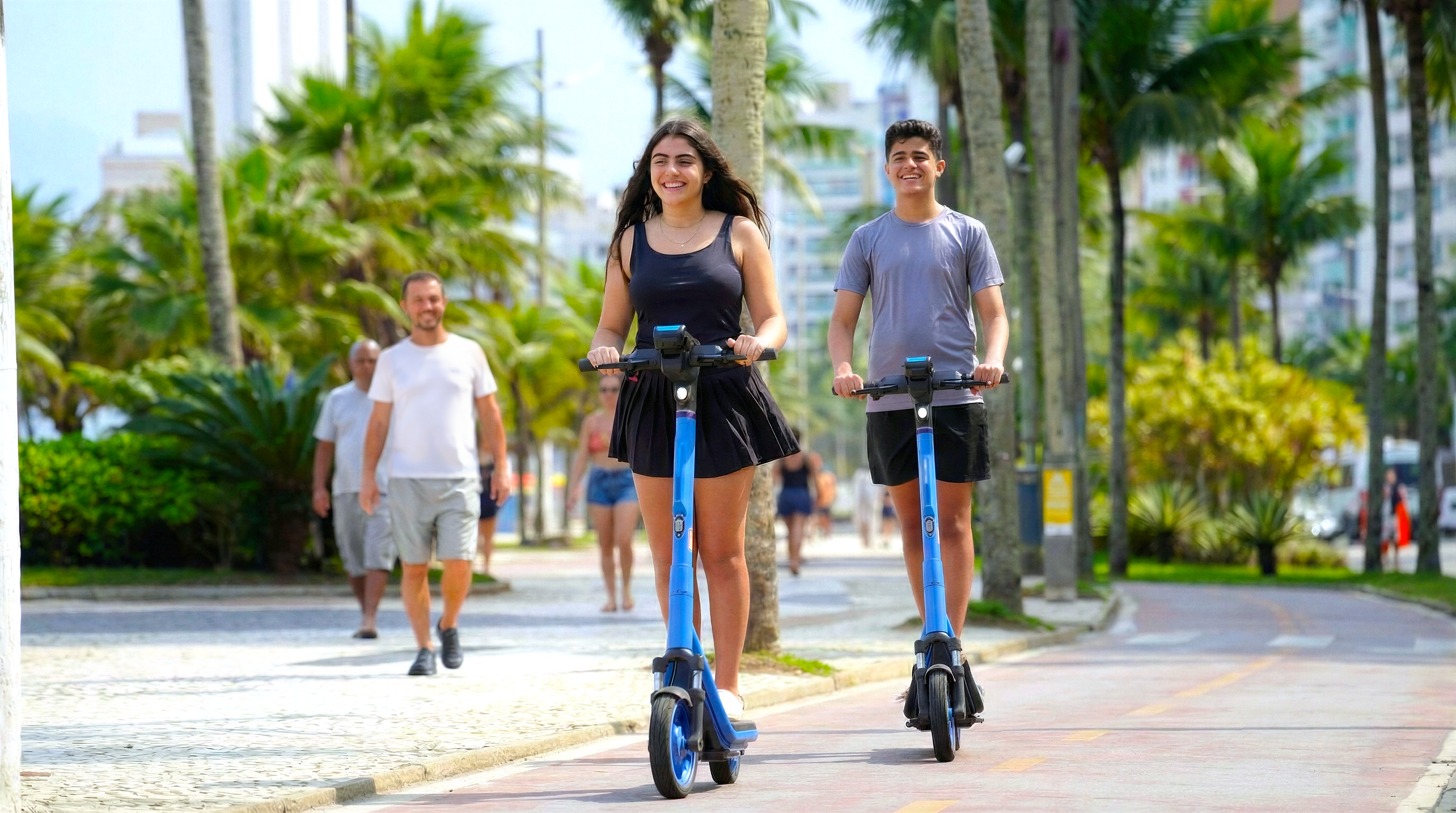
An easy way to getaround Brazil’s cities.
JET LATAM helps you find and unlock a scooter in seconds, so you can explore the city on your own schedule. Visiting Brazil? Tourist-friendly sign-up is supported, so you can start riding without hassle.
JET LATAM on Instagram
Download CV
Telegram
Get in touch
© 2007–2026 Pavel Paulau
‹ Back
Download CV
Telegram
Get in touch
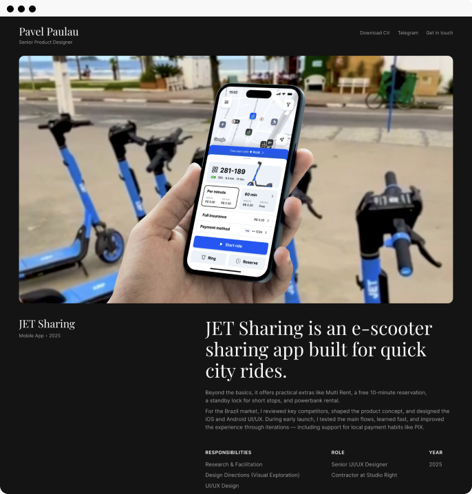
JET is an e-scooter sharing appbuilt for quick city rides.
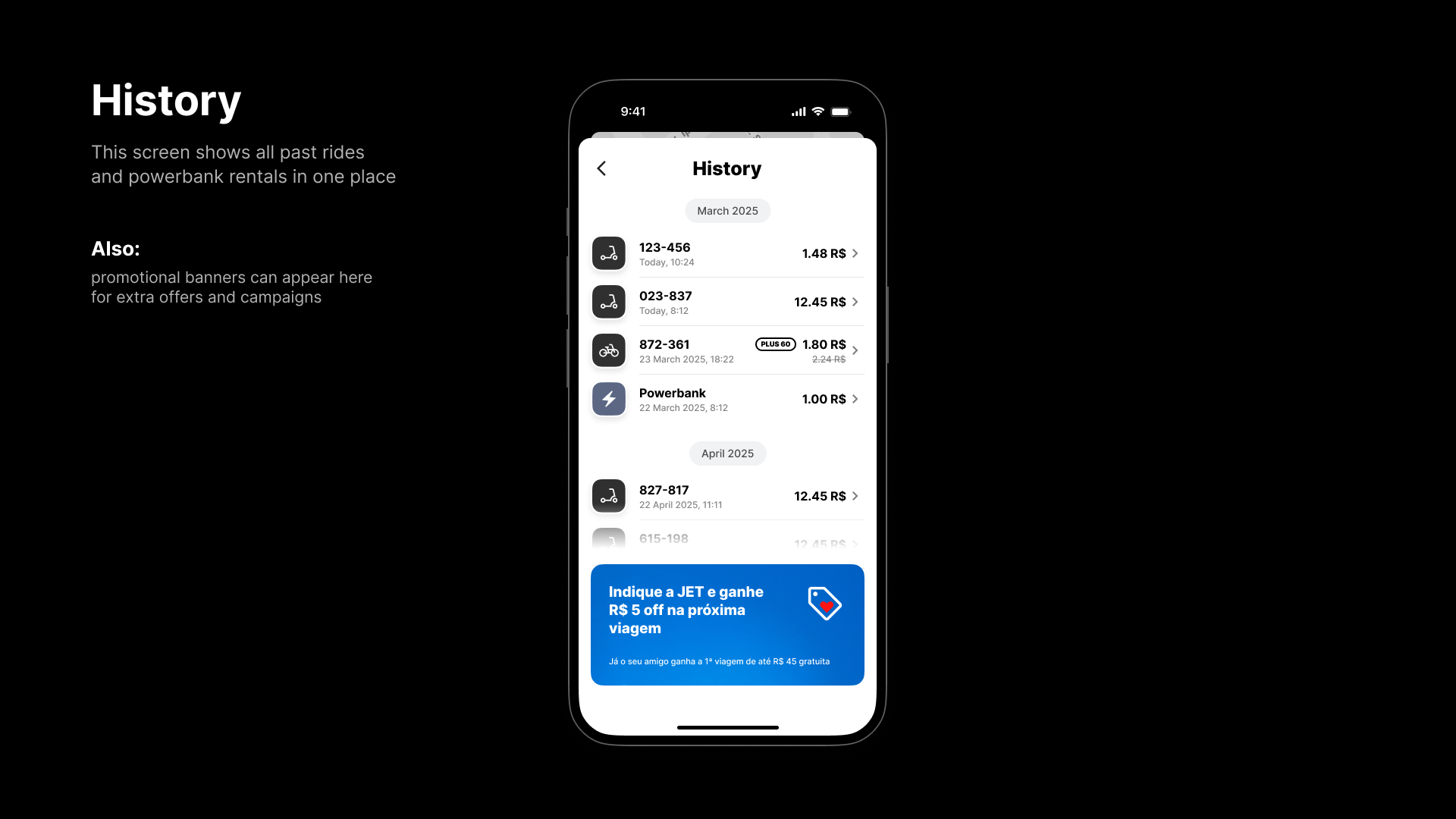
Beyond the basics, it offers practical extras like Multi Rent, a free 10-minute reservation, a standby lock for short stops, and powerbank rental. For the Brazil market, I reviewed key competitors, shaped the product concept, and designed the iOS and Android UX/UI.
During early launch, I tested the main flows, learned fast, and improved the experience through iterations—including support for local payment habits like PIX.
ROLE
Senior UX/UI Designer
RESPONSIBILITIES
Research & Facilitation
Design Directions
UX/UI Design
Usability Testing & Iteration
RELEASE
2025
JET LATAM
Mobile App
3.5K RATINGS


AGES

Years
CATEGORY

Health & Fitness


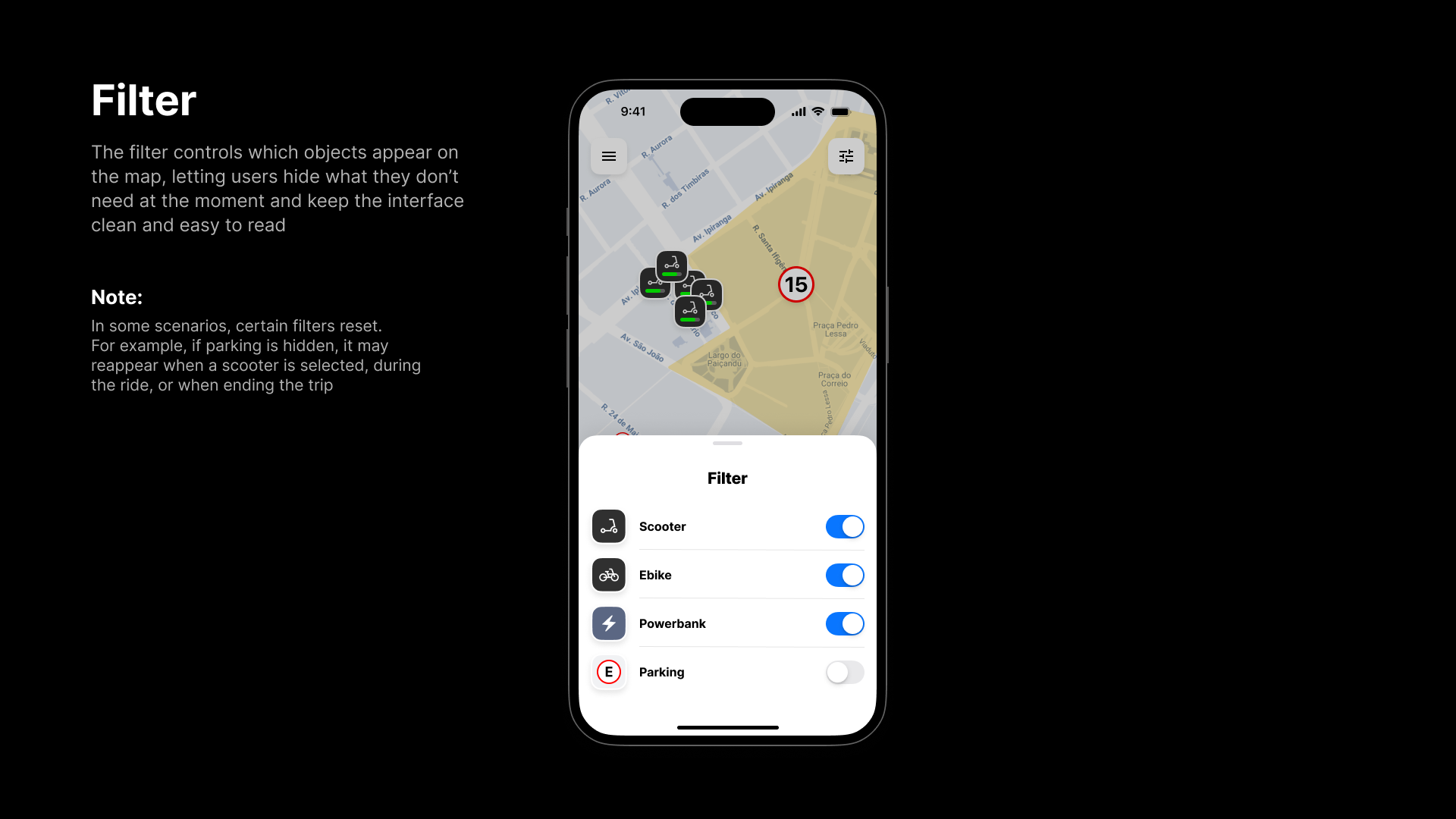
Filter
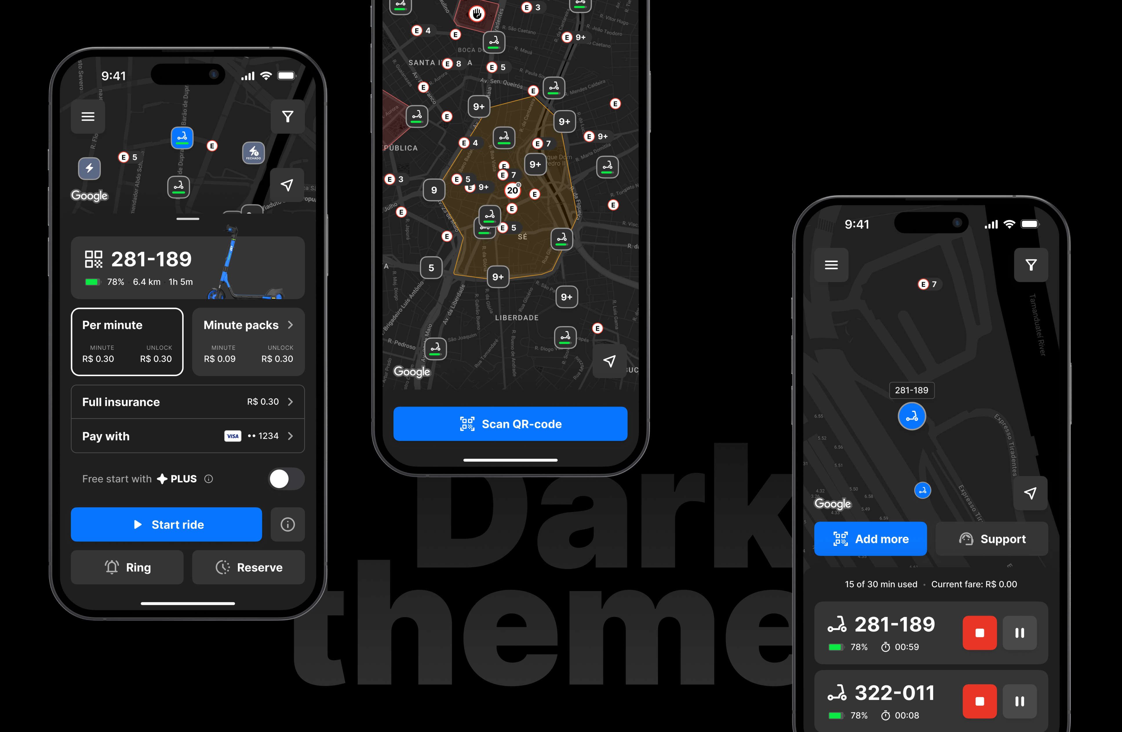
Menu
Location
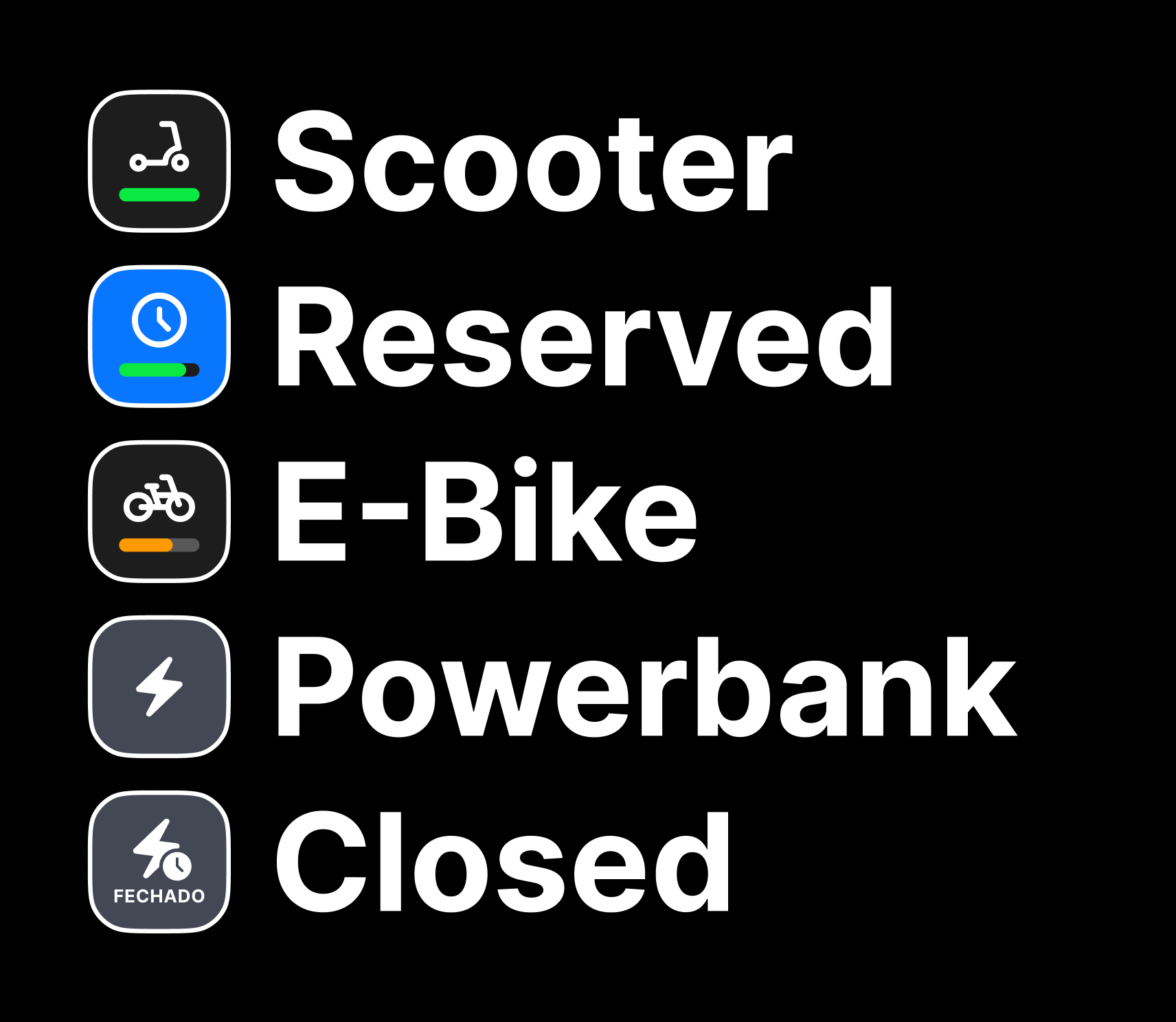
Active button
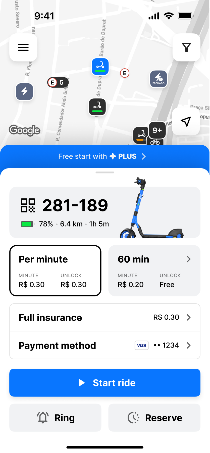
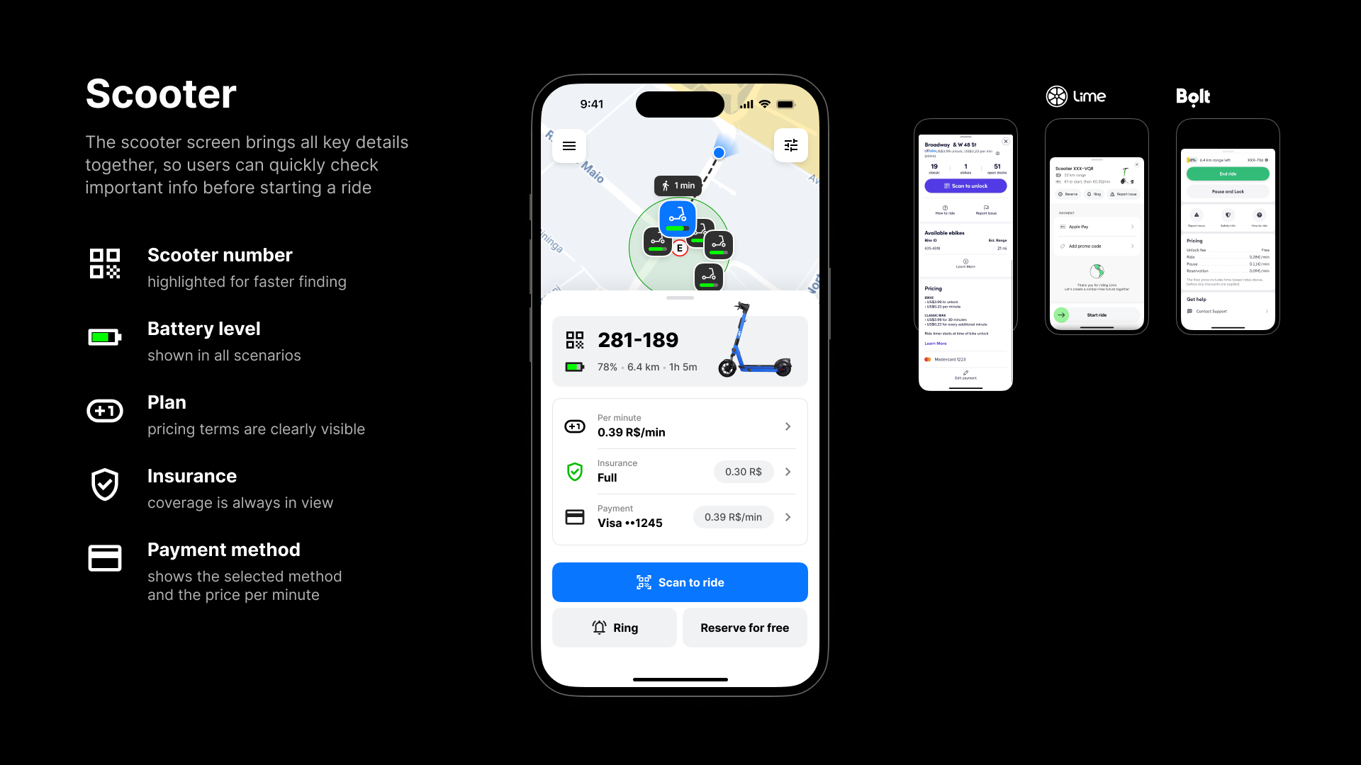
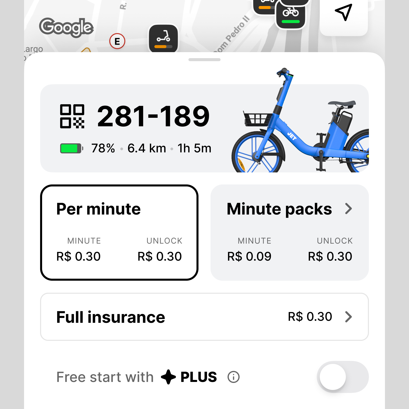
Scooter card
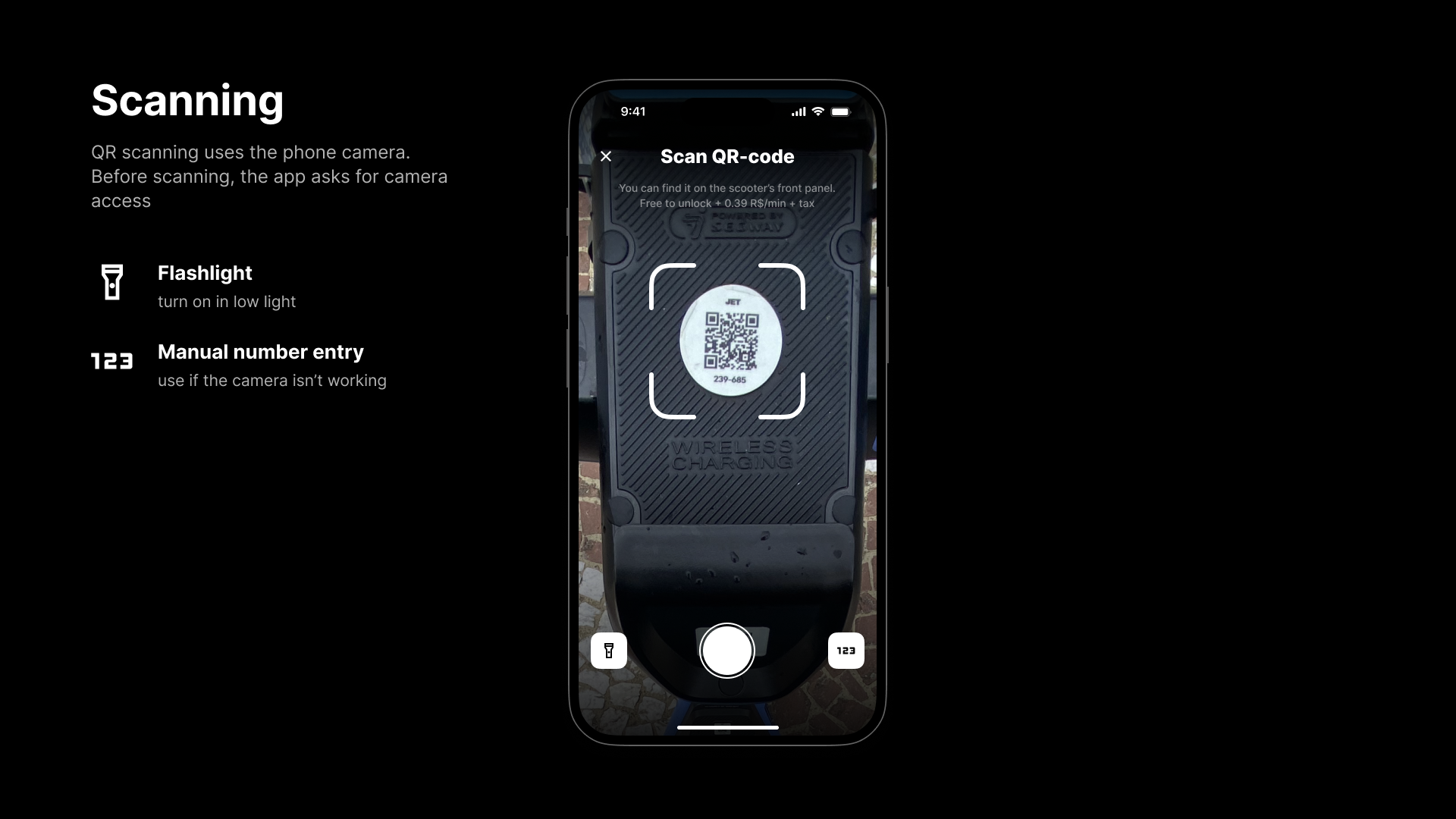
Shows the selected scooter’s key stats (ID, battery, estimated range/time) so users can understand how far they can ride before starting
Subscription
Opens PLUS subscription details and benefits
Current plan
The currently selected pricing option used for this ride
Insurance
Insurance is on by default for extra safety, but users can opt out if they prefer
Payment method
Lets users choose a payment option, including local PIX
Ring
Makes the selected scooter play a sound to help find it among others
Minute packs
Discounted minute bundles (e.g., 60 min) to save money compared to paying per minute
Reserve
Holds the selected scooter for 10 minutes

The task was to prepare the JET mobile experience for launch in Brazil and make key flows fast, clear, and familiar.

Local User Habits
Local Brazilian habits and expectations shaped the design, making key flows feel natural from the start.
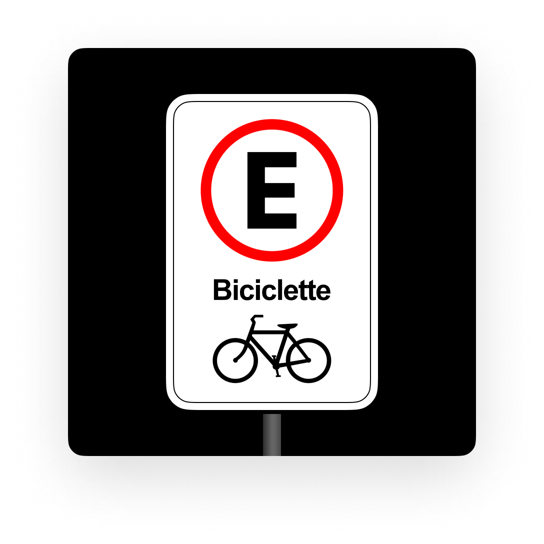
Local Road Sign System
Local road signs and symbols were reflected in the UI, making parking and map guidance easier to understand.

PIX Payments
PIX was added as a local payment option, matching everyday habits and speedingup top-ups and minute packages.
The concept was shaped through competitor research and user expectations. It defines structure, visual language, and core mechanics.
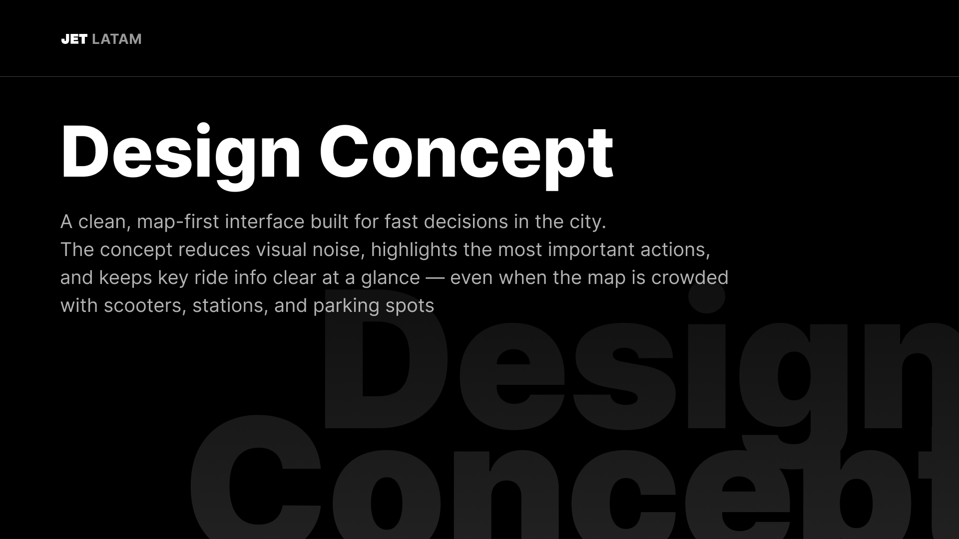


The guidelines define clear rules that keep the design consistent and easy to use. They help make decisions faster and stay aligned.
Palette
A functional color system built for clarity and contrast across mobile screens. Neutral tones keep the map readable, while accent colors highlight key actions, statuses, and navigation points at a glance.
Soft White
RGB: 0 0 0 0
HEX: 000000
Urban Gray
RGB: 48 48 48
HEX: 303030
Carbon Black
RGB: 255 255 255
HEX: FFFFFF
Signal Yellow
RGB: 254 201 25
HEX: FEC919
Fresh Green
RGB: 89 179 39
HEX: 59B327
Digital Blue

RGB: 9 118 225
HEX: 0976FF
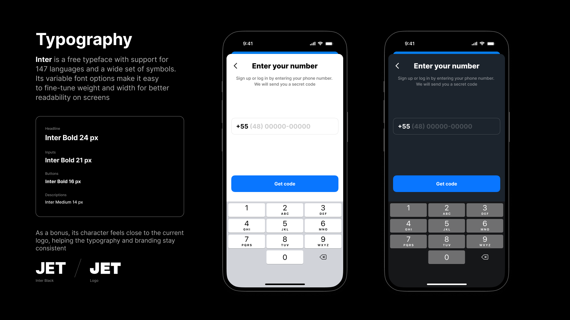
Inter: Readable by Design
Inter is the app’s primary typeface. It was chosen because it’s built for on-screen readability, free to use, and comes with broad character support — a practical foundation for a product that’s planned to scale across many countries and languages.

Icons
Material Symbols were chosen as a universal icon set that works well in UI. They’re available in SVG/PNG for web, iOS, Android, and design tools, support different styles and stroke weights, and are free to use under the Apache 2.0 license.

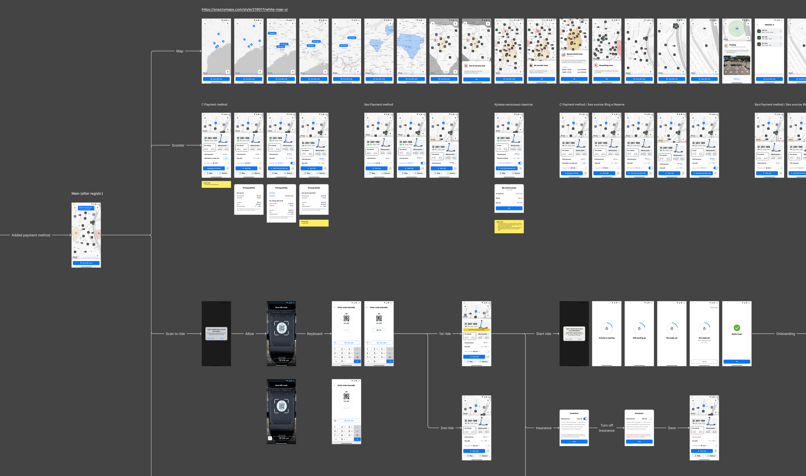
The solution is iOS and Android UI/UX: map, vehicle selection, start/end ride, and payments. Early flows were tested and improved through iterations.


PLUS power
Get free starts, 5% cashback, and up to 25% off insurance — only R$ 29.00/month!
Get

PLUS
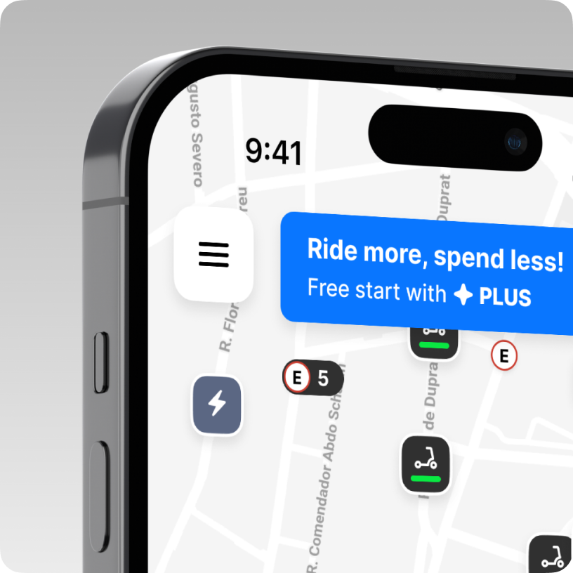
Subtle Subscription Promotion
PLUS is promoted in a lightweight, non-intrusive way—visible when it’s relevant, but never blocking the main ride flow. This keeps the experience focused while still communicating the value of the subscription.
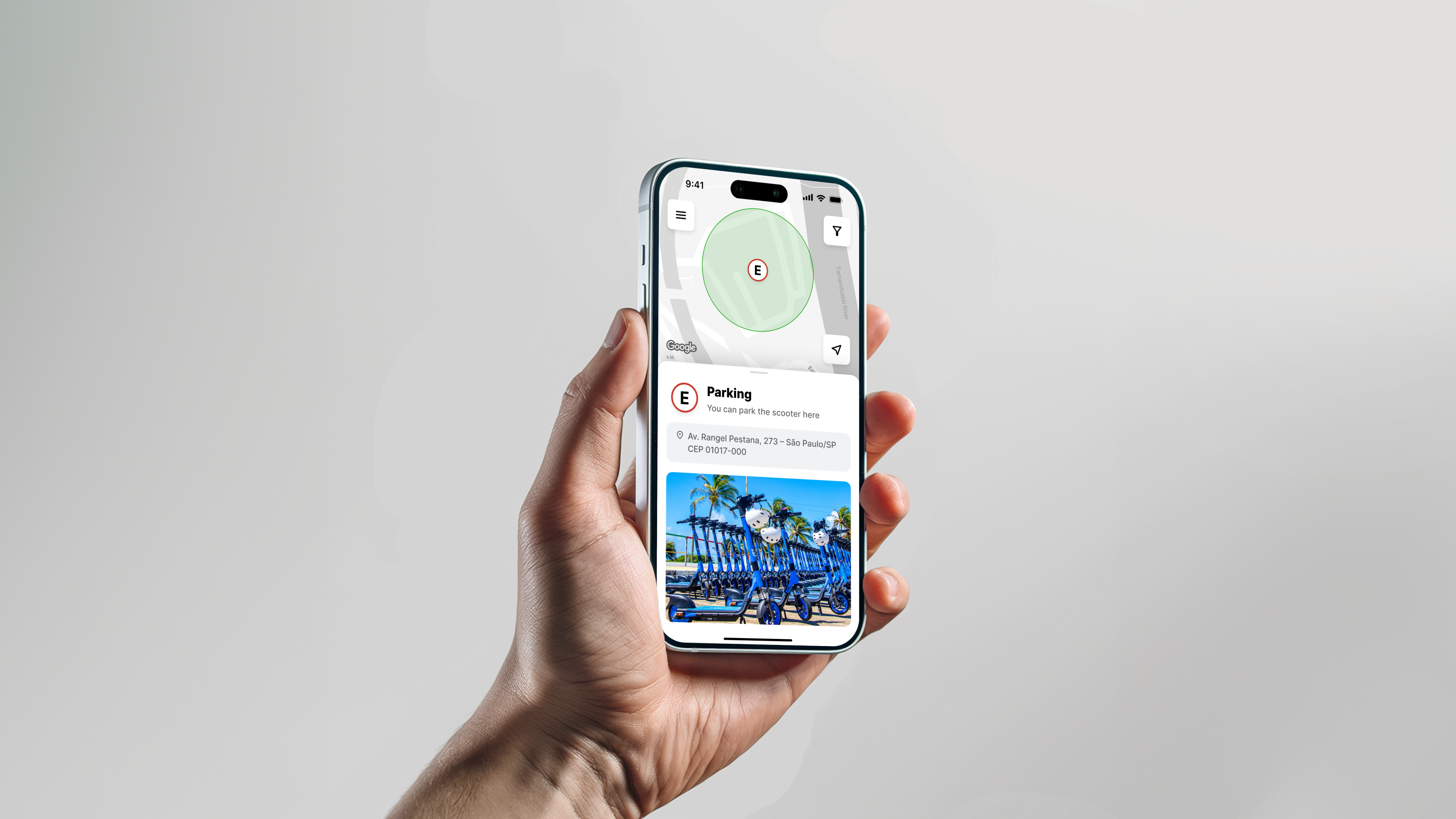
Map Design Concept
Parking Zone
Tapping a parking marker reveals the full parking zone, showing the exact area where the scooter can be left without issues. This reduces guesswork and helps users end the ride correctly.
In-App Training Stories
Short story-style screens teach users how to ride and use the service correctly. The format feels familiar, making key rules and tips easy to learn.
More Than Scooters
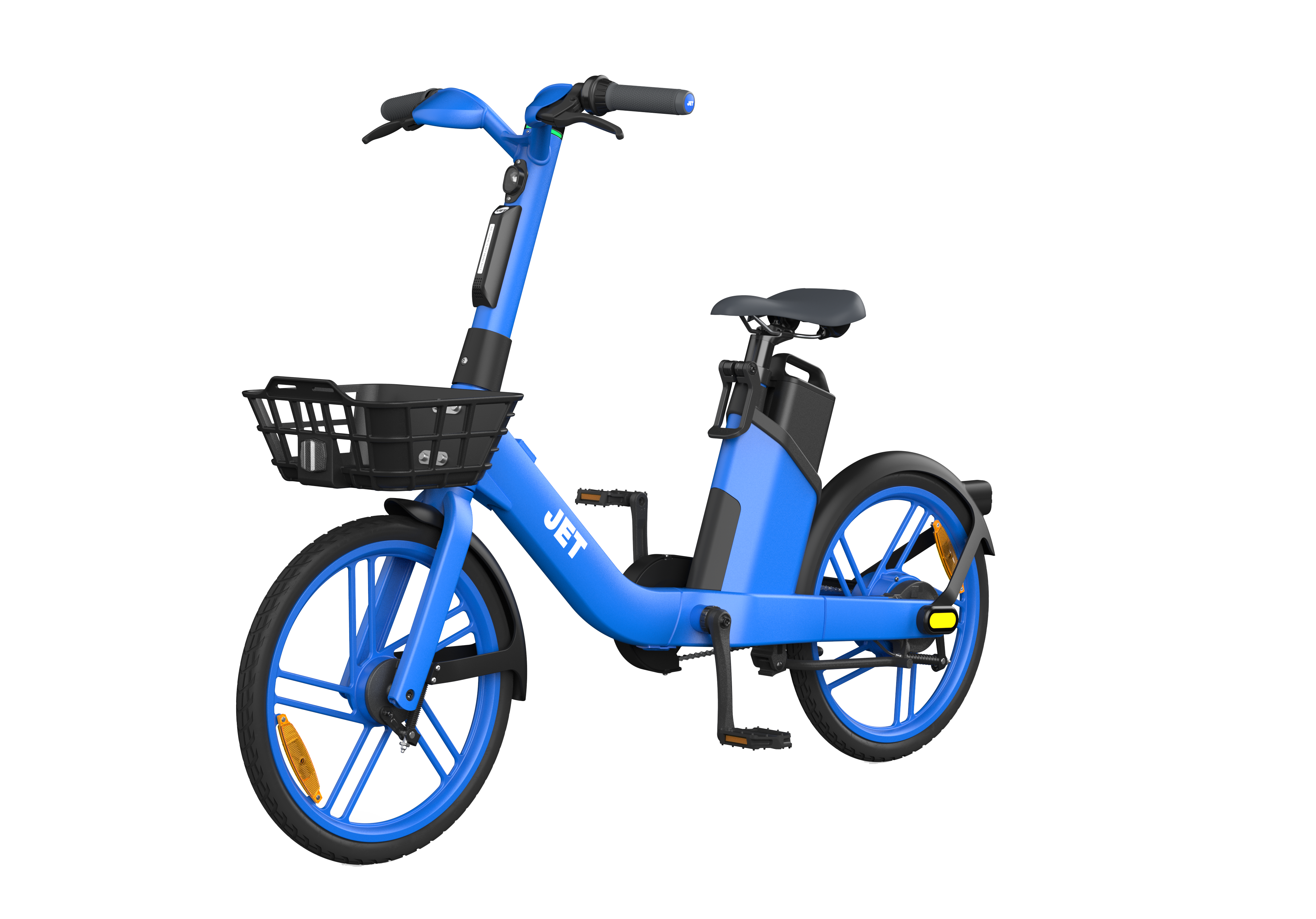
Along with e-scooters, the service also offers e-bikes for longer, more comfortable rides. The interface stays familiar, and all key features are available before the ride starts.
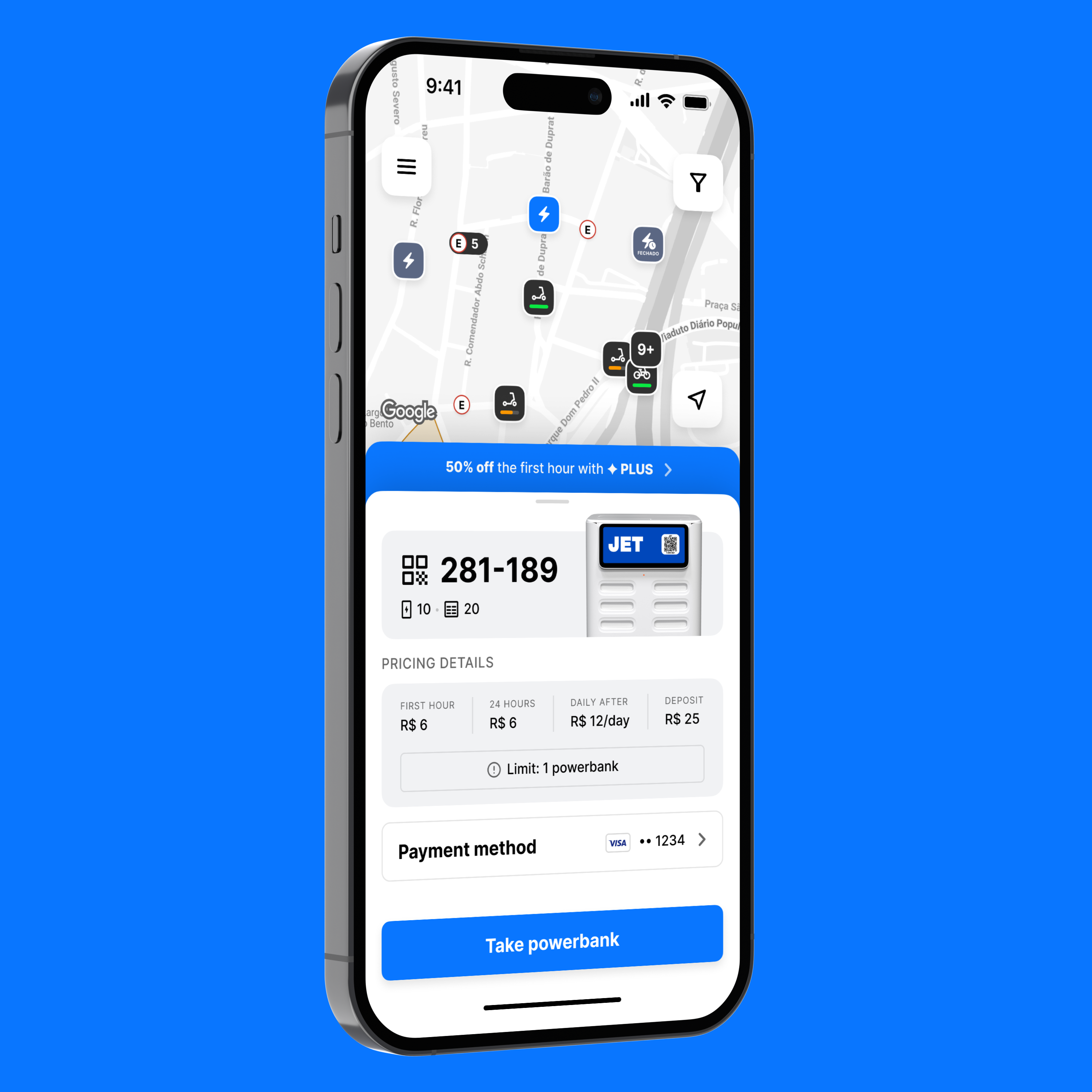
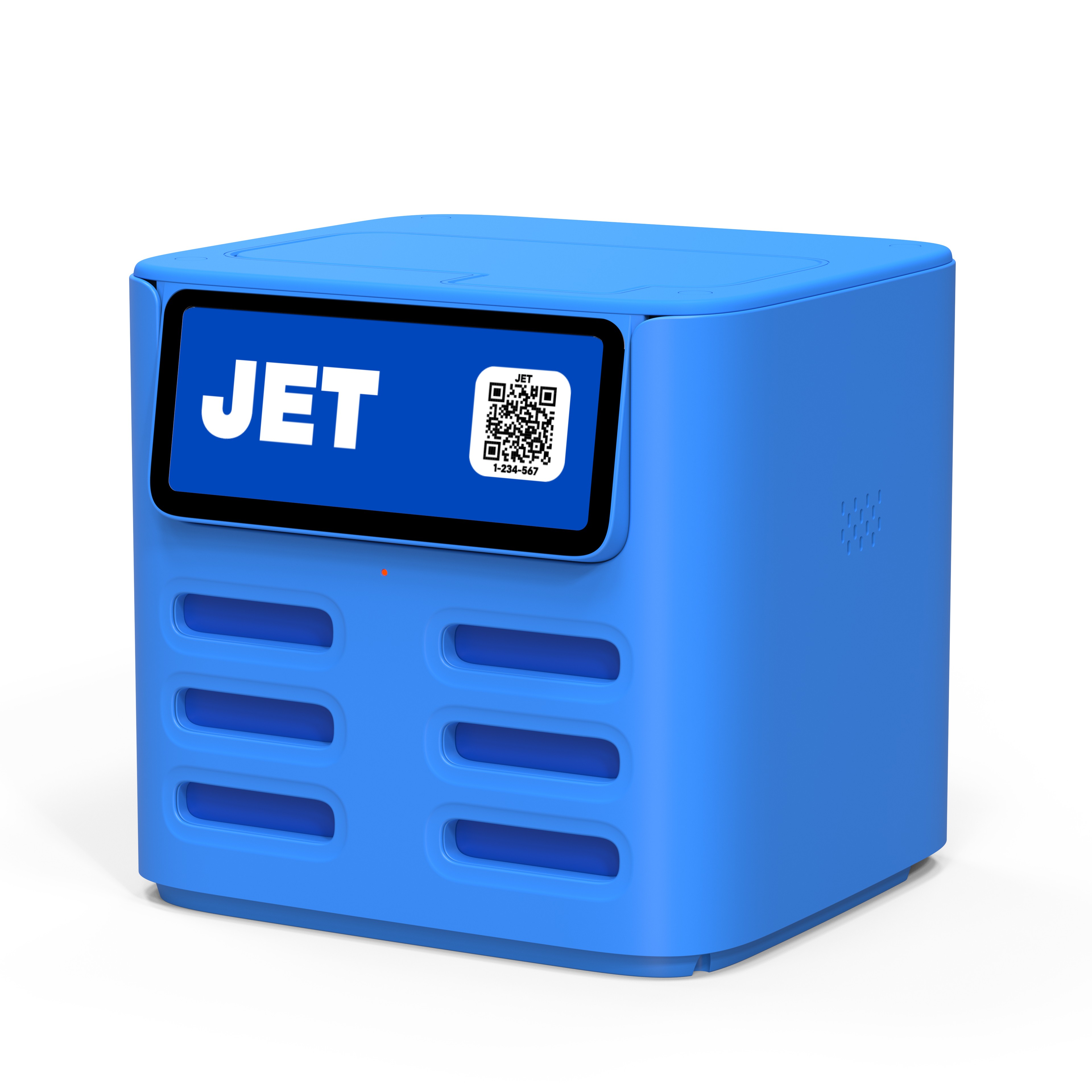
Powerbank Rental
Powerbank rental lives inside the same app without adding clutter to the main ride flow. It appears when it’s relevant, giving users a smooth, dedicated path to rent a powerbank — as thoughtfully as renting a vehicle.
Scaling is supported by flexible components, clear navigation, and multi-language support. The design is easy to adapt for new cities and countries.
Designed for Every Device
Brazil has a wide range of device generations and budgets, so the experience was designed to work fully even on older phones. Core flows stay fast, readable, and feature-complete across screen sizes — not just on the latest devices.
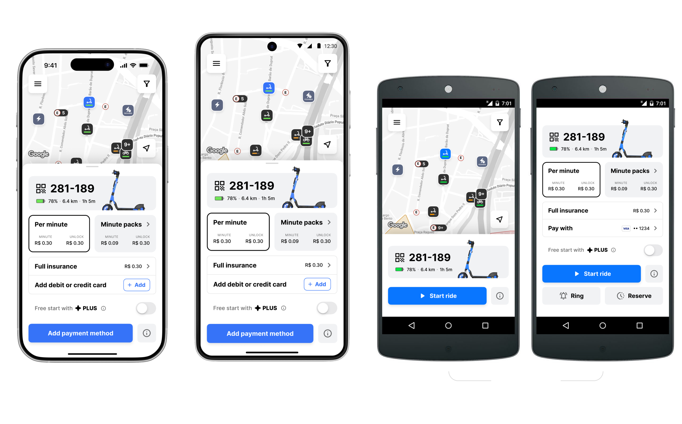
Modern iPhone402x874
Modern Android412x917
Older Android360x640
JET LATAM
An easy way to getaround Brazil’s cities.
JET Sharing helps you find and unlock a scooter in seconds, so you can explore the city on your own schedule. Visiting Brazil? Tourist-friendly sign-up is supported, so you can start riding without hassle.
JET LATAM on Instagram
© 2007–2026 Pavel Paulau